Our client Enough is a small company that was barely a month old when we were contracted by them. They had created a campaign that has the purpose to spread awareness in the Middle East about the violence against women.
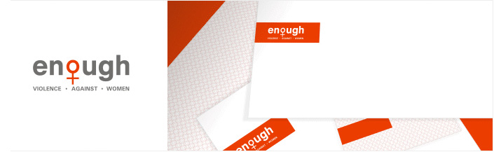
The above client offered limited initial specifications for our designing team to work with. However, he made it clear that he would prefer his logo to be friendly and not scare people away. We designed the identity package to make their clients instantly recognize what this company stood for and the fact there was a lot of compassion in the organization. Our designer used the concept of a female sign to relate to the feminist campaign. We chose white coloration against a red colored background for the stationary and gray as the primary color for the logo. The result was both eye-catching and instantly appealing.