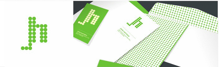
Our client John Hartman has been practicing architectural and interior design in Manhattan since 1990. Her work is characterized by elegant and well-defined architectural solutions combined with comfy, beautiful furnishings. The client is gifted with the reputable image of mixing periods and design ideas with confidence and instinctive style.
John Hartman contacted us in order to get a clean, tastefully colored corporate identity. She also suggested that she would prefer a classic but not stale overall image. Our designer created an elegantly-looking stripes design using blue-greens, corals, dark-chocolate brown and touches of yellow to make it appear a little less "mod" and more earthy. He also included John Hartman's fax, email & zip code in her stationary as she requested.